When it comes to web design, there are a few basic rules you should follow to ensure that your website is both user-friendly and appealing. Here are some of the do’s and don’ts of good web design:

1. Keep it simple
When you’re writing, it’s important to keep your content simple and easy to understand. This helps ensure that your readers will be able to follow along and get the most out of what you have to say. When in doubt, always err on the side of simplicity.
2. Make it easy to navigate
Your navigation is one of the most important elements of your website. It should be easy to use and guide people to the information they need. A good navigation menu will help people find what they’re looking for, and make it easy to get around your site.
There are a few things to keep in mind when creating a navigation menu:
- Make sure it’s easy to see and use. Your navigation should be prominent and easy to find.
- Use clear and descriptive labels. People should be able to understand what each link leads to without having to click on it.
- Keep it simple. Too many options can be overwhelming. Stick to the essentials and only include links that are relevant to your audience.
3. Use fonts and colors that are easy to read
When it comes to fonts, stick to those that are easy to read. The last thing you want is for your readers to strain their eyes trying to make out the words on your site. As for colors, again, go for something that will be easy on the eyes. A good rule of thumb is to use a light background with dark text. This contrast makes it much easier for people to read.
If you want to get really creative with your fonts and colors, there are plenty of resources out there that can help you. Check out these sites for some inspiration:
- https://www.canva.com/learn/100-color-combinations/
- https://www.w3schools.com/css/css_colors.asp
- https://fonts.google.com/
- https://www.pexels.com/search/colorful/

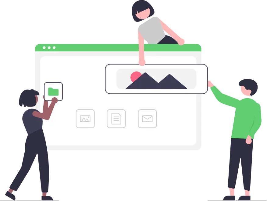
4. Use images sparingly and make sure they are relevant
While images are great for catching a user’s eye and breaking up text, using too many can slow down your page loading time. Also, be sure that any images you use are relevant to the topic of the page.
You can improve your SEO by using Alt tags on your images. The Alt tag is a brief description of the image that shows up in place of the image if it doesn’t load properly. This gives the search engines another clue as to what the image is about and can help your ranking in search results.
5. Don’t use too much animation
A little goes a long way when it comes to animation. You don’t want your pages to be too busy and overwhelming for visitors. Instead, focus on using animation to guide visitors towards calls-to-action. This will help ensure that they take the desired actions on your site. Too much animation can also be distracting, so use it sparingly. When in doubt, less is more.
6. Make sure your website is responsive
With more and more people using mobile devices to access the internet, it’s important that your website is responsive. This means that it will automatically adjust to the size of the screen it’s being viewed on, whether it’s a desktop computer, laptop, tablet or phone. A responsive website looks good no matter what device it’s being viewed on and makes it easy for people to navigate.
If your website isn’t responsive, you could be losing out on business. A recent study showed that almost half of all internet traffic now comes from mobile devices, so if your website isn’t optimized for them, you’re missing out.
There are a number of ways to make your website responsive. One is to use a responsive template or theme, which will automatically adjust the layout of your website based on the screen size. Alternatively, you can use a responsive design plugin or tool to create a custom responsive design for your website.
No matter how you choose to make your website responsive, it’s important to do so. Not only will it look better on mobile devices, but it will also be easier for people to navigate
7. Test your website on different browsers and devices
It’s important to test your website on different browsers and devices to make sure it looks and works the way you want it to. Not all browsers (and even versions of the same browser) render web pages the same way, so you need to test your site to make sure it looks and works the way you want it to in all of the most popular browsers. In addition, people view web pages on all sorts of different devices these days (laptops, tablets, smartphones, etc.), so you need to test your site on as many different types of devices as possible to make sure it looks and works the way you want it to on them.
There are a few different ways you can go about testing your website:
- Use a Browser Testing Service: There are a few different browser testing services that will allow you to test your website in all kinds of different browsers and devices. These services usually have a monthly fee, but they’re definitely worth it if you want to make sure your website looks and works great on all browsers and devices.
- Use Browser Emulators: Browser emulators are software programs that allow you to emulate different browsers on your computer. This can be helpful for testing specific browser versions or for troubleshooting problems with your website.
- Use Browser Plugins: Browser plugins are small programs that you can install into your web browser that will help you test your website in different browsers and devices. There are a number of different plugins available, so you should be able to find one that fits your needs.
- Use Mobile Device Simulators: Mobile device simulators are software programs that allow you to emulate different mobile devices on your computer. This can be helpful for testing how your website looks and works on different types of mobile devices.
- Use a Physical Device: If you have a physical mobile device (such as a smartphone or tablet), you can use it to test your website. This is the best way to test your site on a mobile device, but it’s not always practical if you don’t have access to the specific device you want to test.
Whichever method or combination of methods you choose, make sure you test your website in as many different browsers and devices as possible to ensure that it looks and works the way you want it to.
That’s It
There’s a lot that goes into designing a good website, but if you keep these tips in mind, you’ll be on the right track. With these 7 tips, you’ll be well on your way to having a great website. Thanks for reading!